Welcome Steven Taylor
Please welcome Steven…
Please welcome Steven…
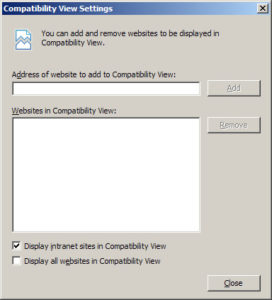
IE8’s Beta 2 has done away with the “Emulate IE7” button of the first Beta, and in it’s place is “Compatibility View”, which is invoked with the broken-document button in the toolbar.

It’s interesting to note that when it comes to Intranets, IE8 defaults to this compatibility setting.

One assumes Microsoft’s reasoning behind this is that they believe that the typical Intranets are not usually known as bastions of standards-based web design, and tend to be given the lowest priority in an organization. Has anyone ever worked at a place where you had full Intranet functionality on a non-IE browser? There must be some out there. I know that there are some state colleges in Florida that have banned IE from the workplace – I wonder what their Intranets look like?
Go here and click on your favorite face parts…

Researchers at UC San Diego conducted a diary study of 20 people’s mobile information needs over the course of two weeks (Sohn, Li et al 2008). At the end of the day their analysis shows us what users really need when their mobile and helps us design more effective mobile site profiles.
In their analysis, Sohn et al dissected 421 information needs and analyzed the heck out of them. But the most interesting findings are probably just the information needs themselves. They placed each need into one of 16 categories. The following categories occurred most frequently:
Of course, you can make the common academic comment that people would make about these types of studies, which is:
“But people only think of these information needs because it’s the type of information that’s actually available on the web…if their minds were open to reporting any information need, we’d probably see a lot more variation or a lot more needs over a period of two weeks from 20 people.”
After reading the article, though, I can tell you that these researchers did a lot to try and not bias the results. I’ll let you read about their methods in the article though (linked below).
At any rate, the raw categorical data does shed some light on how you can design a site’s mobile profile to better address mobile users. For example, if you’re designing a site for a floral shop, you may want to make directions and pricing information more prominent in the mobile profile than in the large screen profile. The directions section would ideally ask someone to type in their “from” address, and submit the form to take them to a mapping service with directions to your store. The pricing section might have three elements:
Their study goes into a lot more detail about the reasons people do or don’t address their information needs while mobile, but I found those conclusions didn’t help as much as understanding the type of information users need in the first place. If you want to read more about the study, you can download it at Tim Sohn’s page at the University of California, San Diego.
Please, let me know if this type of post jives with the rest of the site and Refresh Tallahassee’s goals. If not, I could always find something else that’s closer to our mission.
Cheers!
References
 Yes, I’m a sucker for new interface concepts. With the recent public release of Photosynth and the demo video of Aurora, I though this was worth passing along… 10 Futuristic User Interfaces compliment of Smashing Magazine.
Please welcome Aaron…

After seven years, IDEO launches a new design. Thoughts?
Please welcome Christopher…
 The PDF file below contains all 112 slides used by Christopher Schmitt in his presentation at the Refresh meeting this past Thursday. If you’d like clarification, you can find Christopher through his website.
CSS Inspiration (25.8MB)
Source: Communication Nation